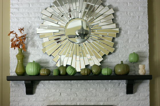
This...
was inspired by this...
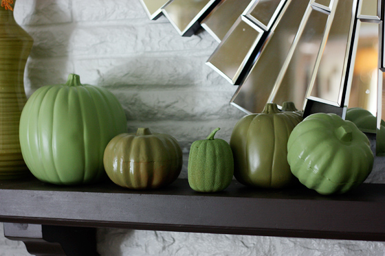
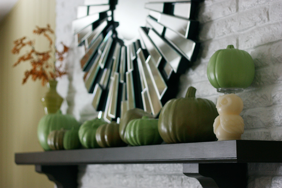
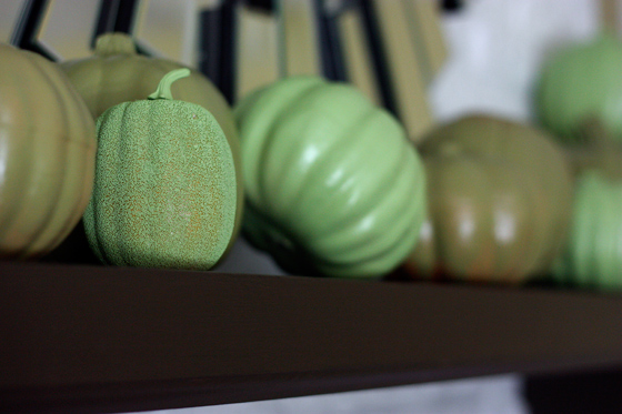
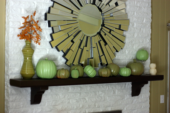
And obviously, the original is much nicer than mine. Because um, well, I'm pretty sure their pumpkins are real. Not some cheap ol' fakes like mine. And I'm not loving the spray paint colors I picked out. The lighter color is a wee bit pastel for me, and the dark color looks blah. Not to mention the dark color brand (krylon I believe?) did NOT cover. Maybe I should have primed (probably) but I didn't. And the light green went on no problem (rustoleum). So when the dark started streaming off the pumpkins I just said screw it and kept going. Pretend you don't see the orange peeking through (and that the pictures aren't crappy quality. bad lighting bad lighting bad lighting meant I didn't use a good aperture for these and had my iso cranked...), ok? Thanks.
I'll probably expand on the idea next year. Maybe try and find a few more sizes of pumpkins for some variety. Change the spray paint colors. Or heck, maybe try and find real pumpkins to use (but these don't rot!). Also I want to find some different stick/flower things and probably a different vase. I got that green one at Pier One super cheap over three years ago. About time for a change isn't it?
You can check out more fall pinterest challenge fun here, here, here and here.



9 comments:
I really like yours! I love the mirror and to be honest I like it better than the one on pinterest!
i think it looks great, and the mirror is amazing! where did you score that beauty??
Looks great!
I like yours better!
Give yourself some credit-- I love it!!
Love it - super creative!
I like yours better, too. And, I actually really love the way the orange comes through on the pumpkins. Plus, your added height on the left side adds a whole lot. Nice work. I think you mastered this challenge!
You all are too sweet! Seriously. And the mirror is from ZGallerie.
I love your mantle! Nice job!
Post a Comment